eQube MI

Migration & Integration

Role : UI UX Designer

July 2017 - Ongoing

The Brief

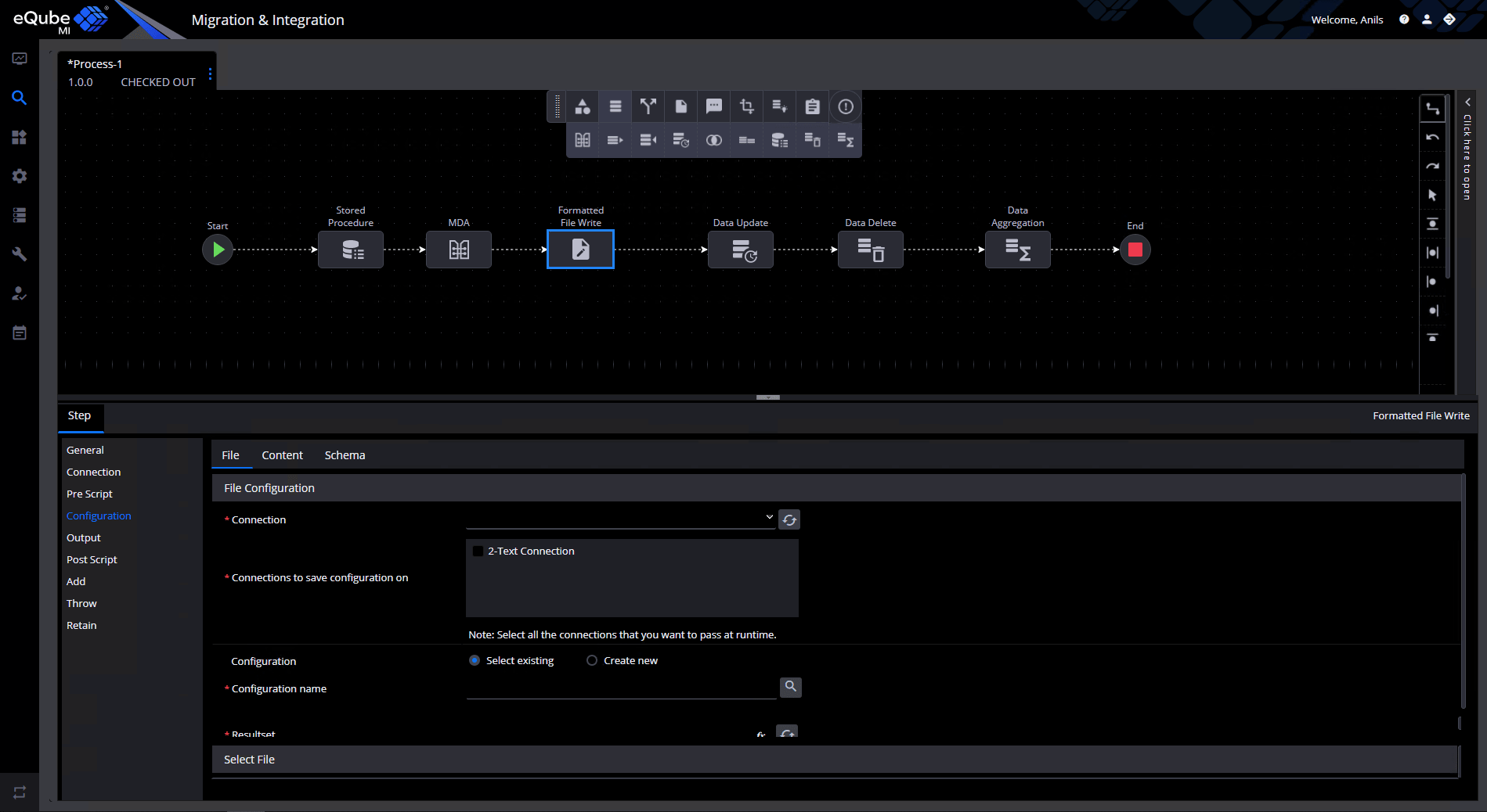
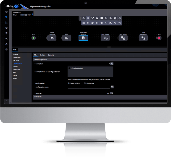
eQube MI is the Application Integration Platform. It allows the users to integrate multiple enterprise applications like SAP, Teamcenter etc and migrate data from one enterprise application to another. The user can create and execute a process on the canvas which is a collection of related, structured activities or tasks that produces a specific product or serve a particular goal for the customer. It often can be visualized with a flowchart as a sequence of activities. It includes various activities like create trigger configuration, configure connections, transports, properties, nodes, logs, audit, create and debug MLV, manage user and their roles etc. eQube MI is a complex tool through which much of company’s revenue is generated.

Design Challenge

Redesign of the complete eQube MI application with additional features to build a cohesive experience that feels seamless and familiar to the user and provide them a better way to Control & Manage the data during migration and application integration.
Research & Analysis

In my role as UI/UX designer I started evaluating the existing design page by page to understand the pain points and finding opportunities with usability improvements. I conducted an expert review of the complete application and focused on Nielsen's 10 usability heuristics followed by the competitive analysis of the similar products like IBM Infosphere, Microsoft SQL, Oracle Data Service Integrator etc. A competitive analysis revealed the strengths, weaknesses, similarities, and differences between competitors.

Visual Thinking on Paper

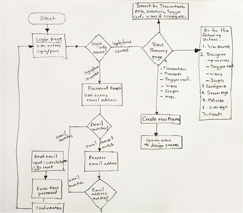
In order to help understand many of the complex processes involved in eQube MI, I mapped workflows on paper. Doing so helped me to understand the particular points where our system could help minimise some of the pain points as well as highlight opportunities where we could really try to improve.

Structuring Content First

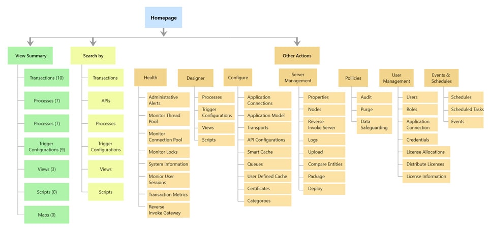
Before starting any design, I spent a great deal of time making sense of app flows and existing content. I face particular challenges with labelling and terminology as we found that language varied between enterprise and another apps. Mapping out the sitemap is also challenging as it involves many different touch‑points with many developers as users.

Sketching Interfaces

Instead of wireframing, I opted to sketch my designs on paper. I used paper prototyping techniques to bring the designs to life and evaluate them with our users. This helped me work rapidly and led me to consider more ideas. Sketching many concepts helped me form a broader view of the system earlier ensuring a more cohesive design.

Mid-fidelity wireframing

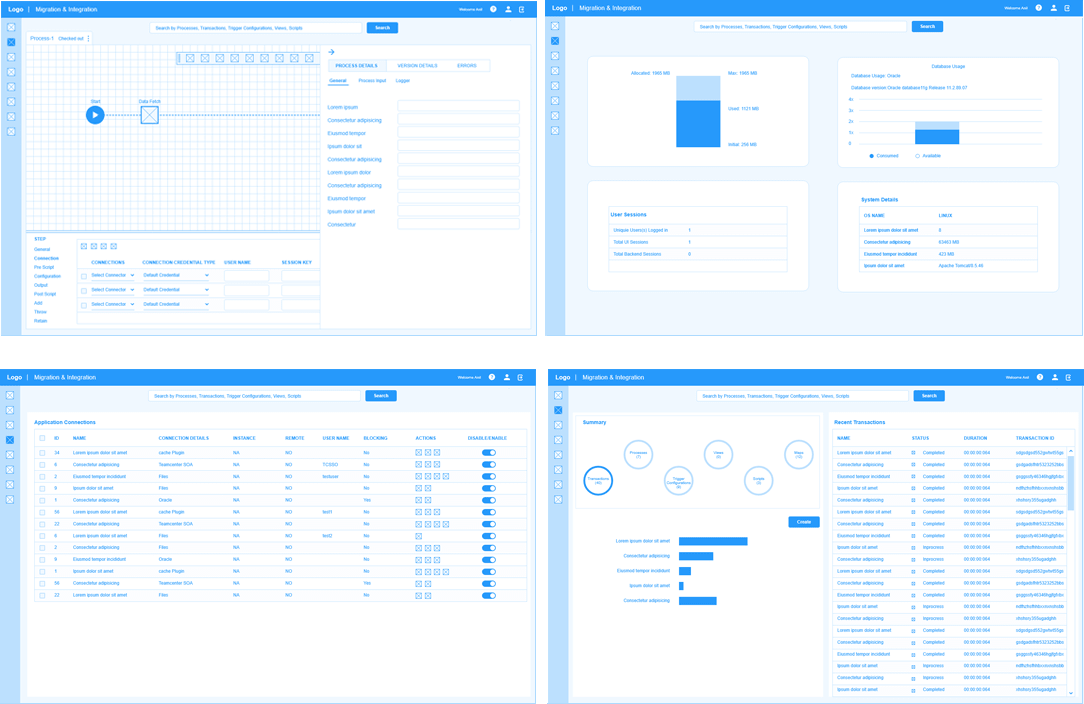
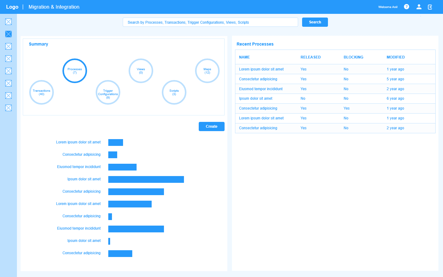
Once I validated conceptual sketches with teams and managers and satisfied with the workflows, I started to work on the user interface itself. I started with a medium fidelity wireframing and then refine it to communicate with teams and provide a common understanding.

Prototyping and Usability Testing

I work closely with our developers team to bring our designs to life as a working prototype. Communicating requirements face-to-face and discussing constraints and possibilities is an effective way of solving the Interaction Design. We work collaboratively, test constantly and iterate progressively.

Hi-fidelity Mockups

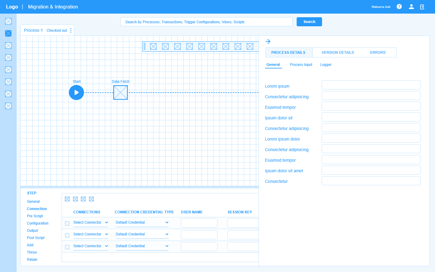
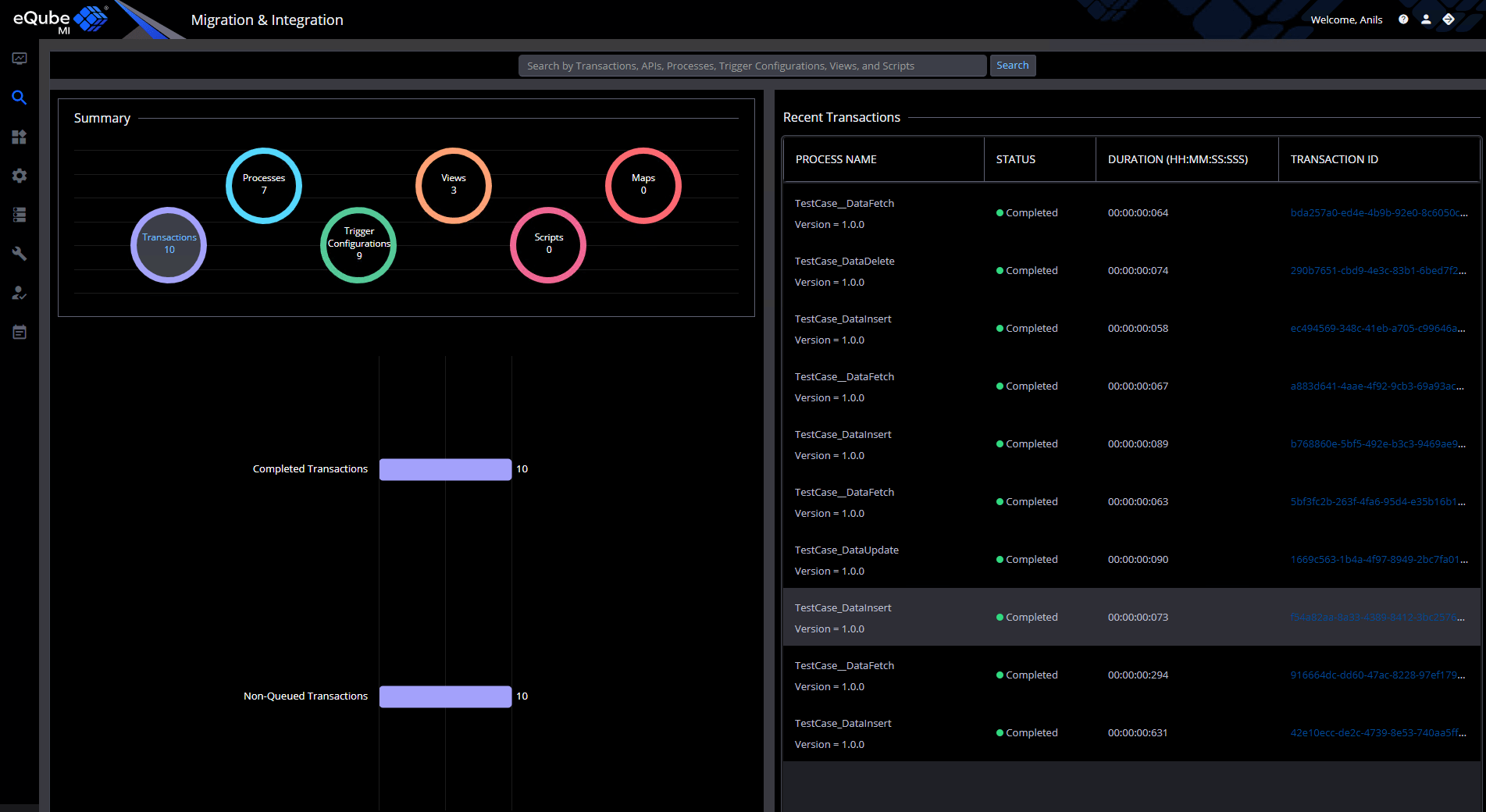
To move forward with the design I use adobe XD or Photoshop to create sets of detailed visual mockups. This approach is beneficial in showing our stakeholders design progress.

For a good period now, the dark mode design is trending in both web and mobile design. Dark mode is a low-light user interface (UI) that uses a dark color—usually black or a shade of grey—as the primary background color. It’s a reversal of the default white UI that designers have used for decades. I designed a visual UI style guide which record all of the design elements and interactions that occur within a product, UX components (buttons, typography, color, navigation menus, etc.) like hover states, dropdown fills, animations, etc.