eQube BI

Business Intelligence

Project Overview

Making complex data easier to understand

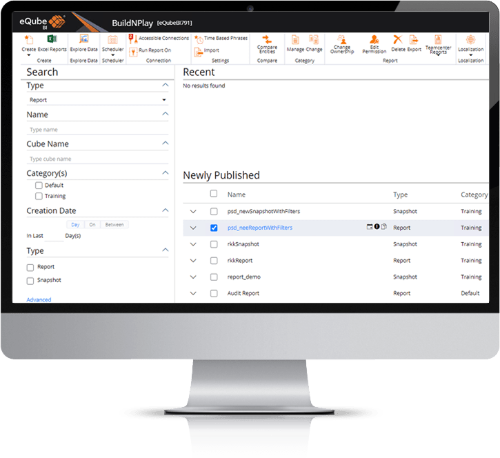
If you are a business analyst or if you simply send frequently reports to clients or managers, then you know how difficult and time consuming it is to create nice and effective reports. eQube is a Business Intelligence and analytical tool. It’s a web based tool which allows users to analyse their business data. A huge data is stored in multiple data sources and its very difficult to read and analyse the required data as its stored in different sources in various formats. eQube BI helps to fetch the relevant data from the data source with the help of connectors like Teamcenter, oracle etc and helps in creating the reports and dashboard based on the business logic applied. Users can generate variety of dynamically updated charts and visualizations which are live.

My Role

User research, User testing, Prototyping, Wireframing and Visual design

I focus on creating a more human experience for users to help them better understand their data and make better decisions for their business. While I cannot share all of my work, here are some project tasks during my time in eQube BI.

Tools:
Adobe XD (wireframes, visual designs prototype, UI UX deliverables), Photoshop (visual mockups),
Design Process

Discovery

eQube BI is a huge web based application and it has tons of features and functionalities which keep on revamping to deliver the best user experience possible. Before diving into the features and the overall UX of the product, I establish brainstorming session, user interviews to understand the requirement into detail. This approach allowed me to gain deeper insights about the problem to be solved and identifying the objective.

Designing the foundations for a usable interface
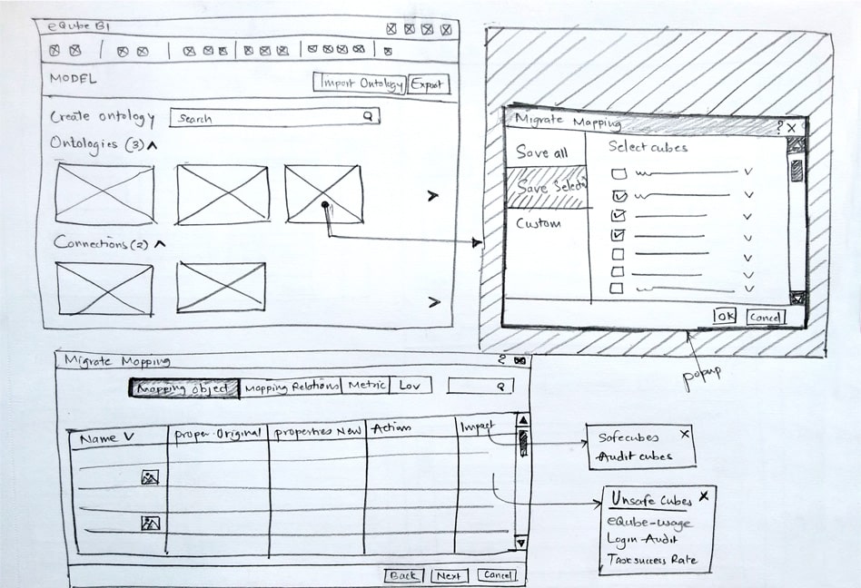
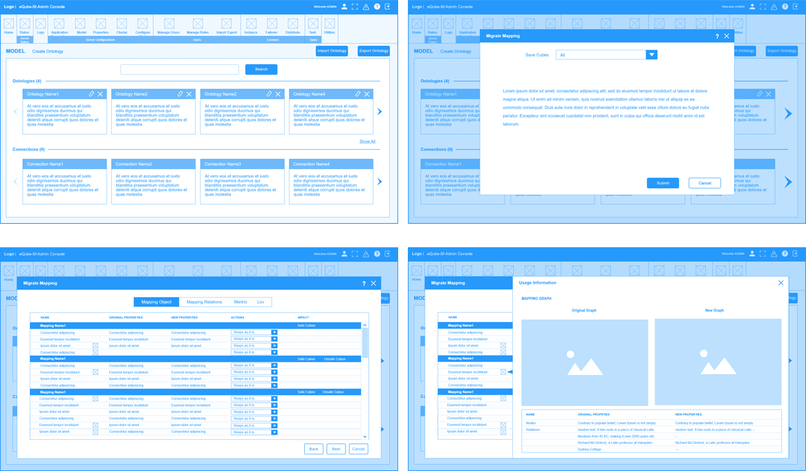
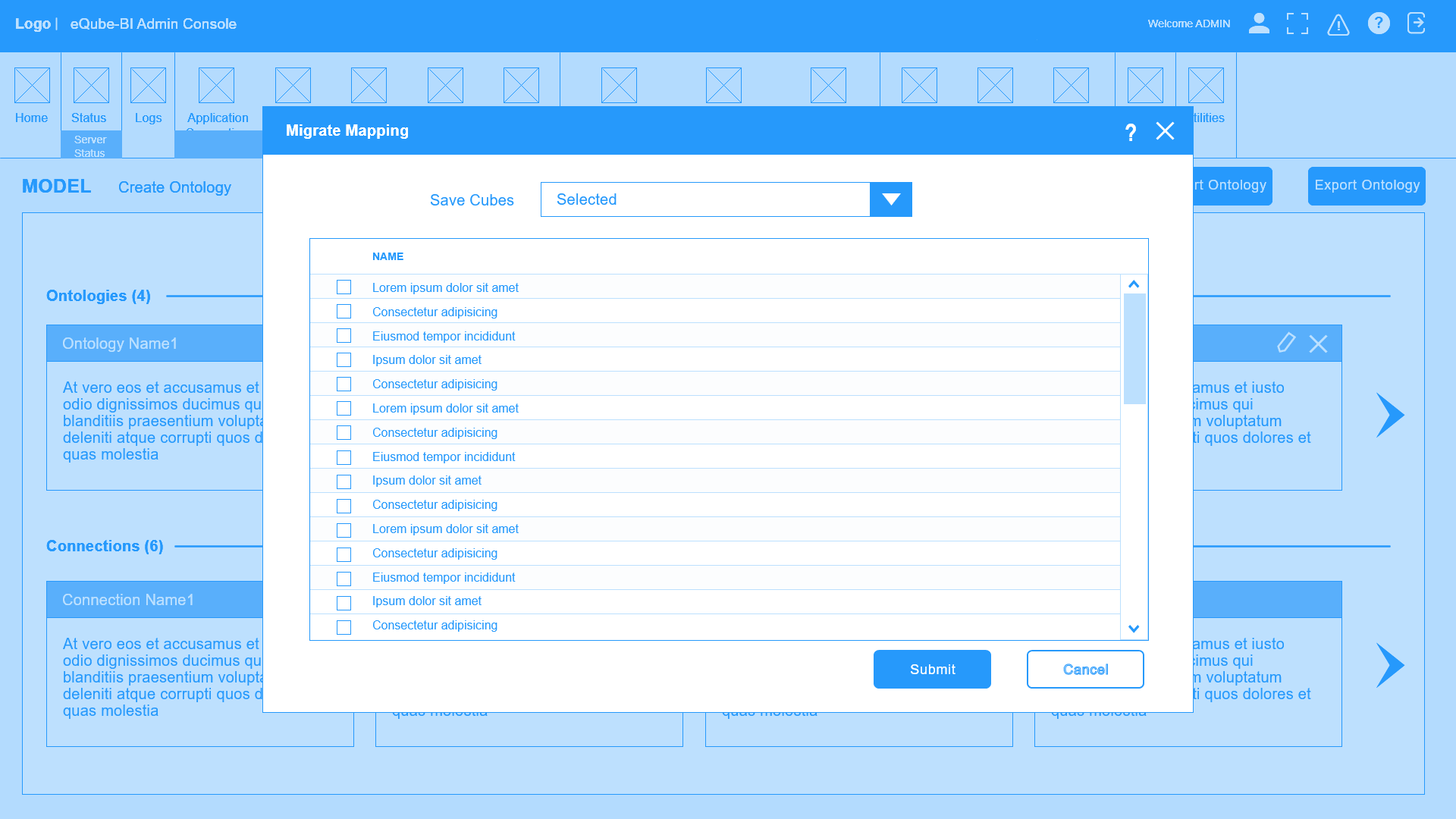
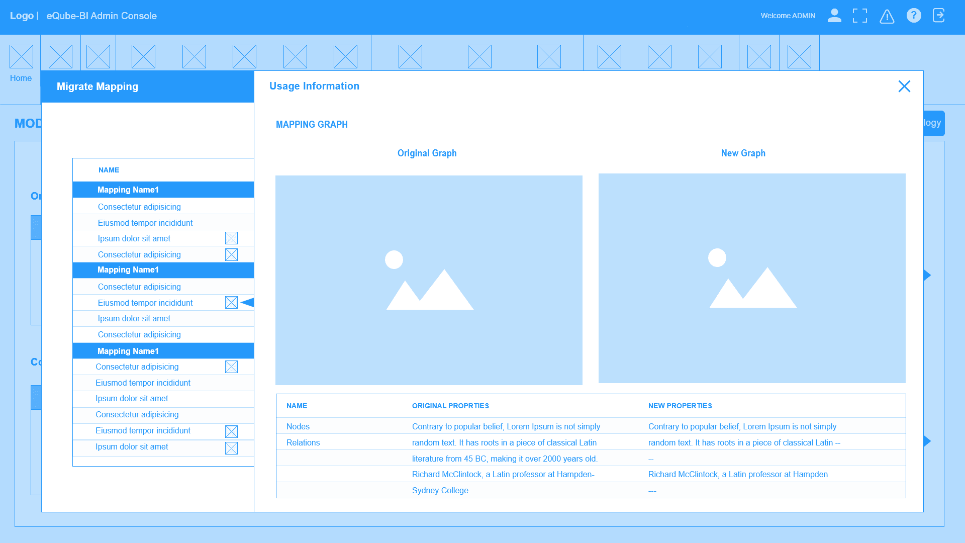
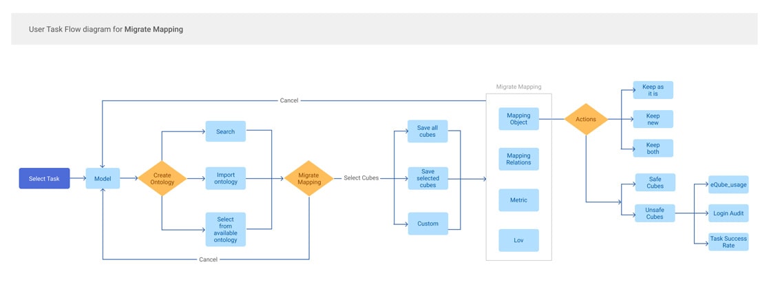
As soon as we are all at the same page concerning the objectives, I start working on userflows and how to achieve tasks in the app. I work on different directions which I validate with the teams. Here is the sample of completing a task of migrate mapping userflow.

Sketching the interface and modules

I sketch various solutions and ran user tests to find the best way to integrating the newly defined functions.

Mid-fidelity wireframing

Once I validate navigation principles with teams and managers and we all satisfied with the rough ideas on
paper, I lstart with a low fidelity wireframing and then refine it to communicate with teams and provide a
common understanding.

Prototype

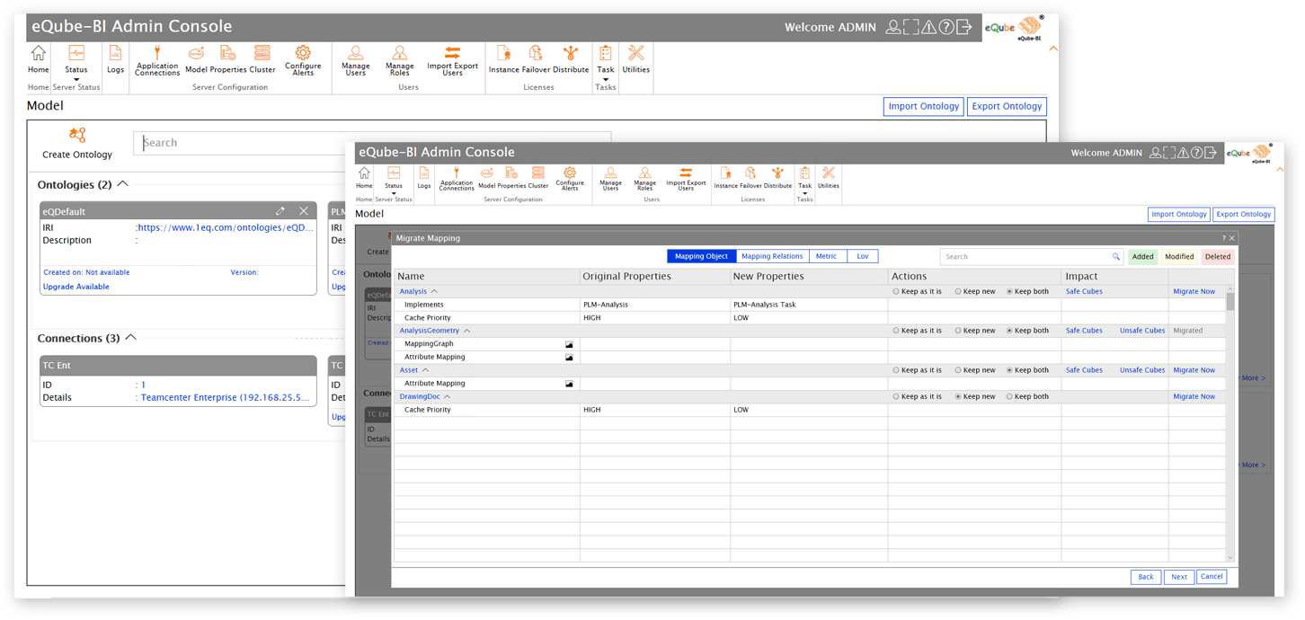
Keeping the user's needs and pain points in mind I come up with my final version of the design and create a prototype to start my testing with the users. For that, I quickly jump onto Adobe XD to create an interactive prototype in order to test dynamically the tool and validate all the principles.

Visual Mockups

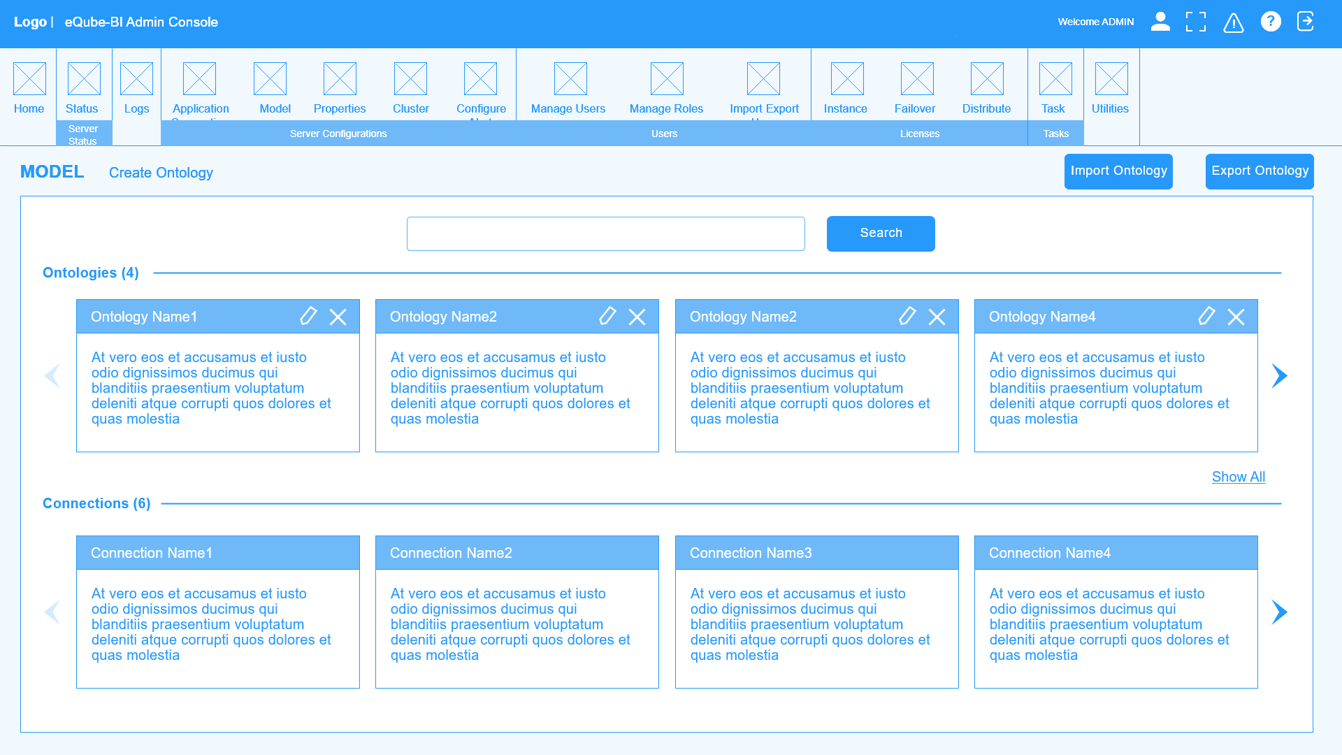
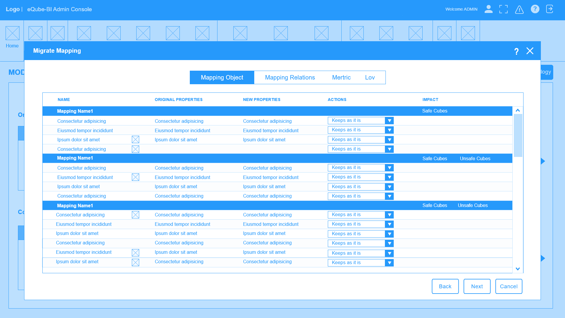
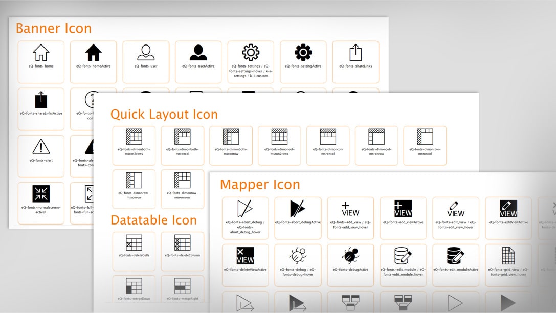
With the skeleton and the prototype validated and tested, I work on the User Interface. I pick up the relevant UI components from the visual library (which I keep updating and modifying) and arrange it properly on the screen real estate.

Design Style Guide

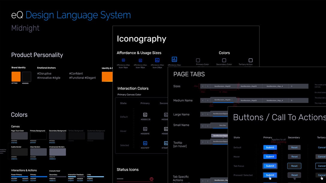
For a good period now, the dark mode design is trending in both web and mobile design. Dark mode is a low-light user interface (UI) that uses a dark color—usually black or a shade of grey—as the primary background color. It’s a reversal of the default white UI that designers have used for decades. I created style tile as a guide for the visual design of the app. It included all of the design elements and interactions that occur within a product, UX components (color palette, buttons, typography styles, imagery, navigation menus, popup designs etc.) like hover states, dropdown fills, animations, etc.

I want to keep the interface simple and minimal, yet colorful as well as playful and attractive. Colors quickly inform the user what he/she can interact with and where the important pieces of information can be found.